Improving upon the Javascript Calculator
Contents
Last week I made a basic javascript calculator on CodePen. After waking up and trying to check the CodePen on my iPhone, I was immediately presented with a white background and a calculator that didn’t fit on my phone’s browser. I guess the lesson is to always check on alternate browsers and systems, but I made the original CodePen entirely on my Windows PC with Firefox and I didn’t check it when I published early Monday morning.
So, we need to fix that background issue and make the calculator responsive so it works on every size of screen. I also found out that when you multiply a 12 digit number (the digit limit of the calculator was meant to be 12), you end up with 13 digits. So that needs to be fixed too.
Here is the finished product:
Fixing the background image
So, why was the background image disappearing on my iPhone? Well it all comes down to Imgur blocking CodePen referrals.
Imgur blocks image requests from CodePen. We can't control that.
— CodePen.IO (@CodePen) November 6, 2015
We offer Asset Hosting that we absolutely support! https://t.co/eKTxff3hfu
But it took me a while to realise that, so I spent a while fiddling around with different background options to no avail. Finally, I settled on this:
1
2
3
4
5
6
7
8
9
10
11
12
13
14
15
16
17
18
19

@media only screen and (min-width: 440px) {
  body {
    background: url('https://res.cloudinary.com/du8zlow0n/image/upload/v1528561905/uteTbQQ.jpg') no-repeat top center fixed;
    -webkit-background-size: cover;
    -moz-background-size: cover;
    -o-background-size: cover;
    background-size: cover;
  }
}

@media only screen and (max-width: 439px) {
  body {
    background: url('https://res.cloudinary.com/du8zlow0n/image/upload/v1528597854/uteTbQQ_mob.jpg') no-repeat top center fixed;
    -webkit-background-size: cover;
    -moz-background-size: cover;
    -o-background-size: cover;
    background-size: cover;
  }
}
The first block serves a 1920x1200 px background to screens over 440px in width. 440px is about the point at which the calculator starts to resize when its max-width is set to 400px (see below).
The second media query issues a cropped portrait 600×1274px image with reduced bandwidth cost, ensuring that the calculator doesn’t overlap other things on the desk at lower widths. You can also see I used Cloudinary to serve the images, rather than Imgur.
These changes have been added to the original post.
Making the calculator responsive
So the calculator fits on my iPhone (now!) because I edited the widths to make it fit, but it is fixed at 325px. This works fine at all but the smallest resolution, so perhaps we can focus on making the calculator resize nicely between 400 and 200px just to show off its responsiveness.
First we need to edit the container:
1
2
3
4
5
6

#container {
  ...
  max-width: 400px;
  min-width: 200px;
  ...
}
This will make the container no larger than 400px and no smaller than 200px.
Next we make sure our buttons respond to changes in width as well:
1
2
3
4
5

.button {
  ...
  width: 20%;
  ...
}
So our buttons and calculator as a whole will adjust size with the browser window width, but that was just the easy part. The text size for both the buttons and display needs to adjust too.
 |
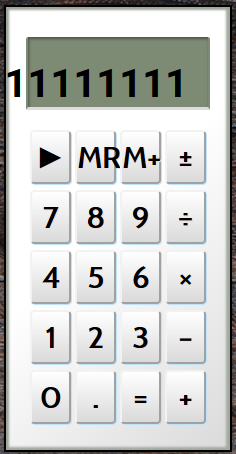 |
| Calculator @ width > 380px | Calculator @ width < 380px |
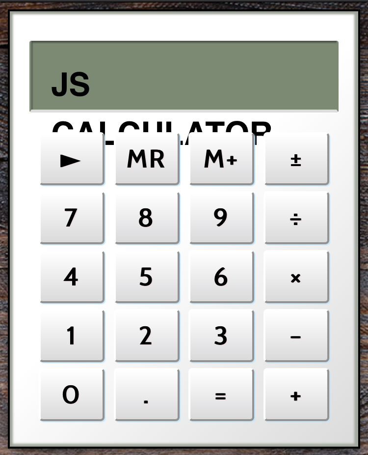
Before we make our font size responsive, let’s fix the title display of the calculator.
Currently it says “JAVASCRIPT CALCULATOR” which is far longer than the display will handle for numbers. Let’s make the title “JS CALCULATOR”. This will remove the need for use to hardcode a new font size when we initially enter a value into the calculator.
1
2
3
4
5

function clearDisplay() {
  clearedValue = '';
  calculatorDisplay.innerHTML = clearedValue;
  return clearedValue;
}
Now onto the font sizes of the buttons and titles. We need the text size to change when the window width drops below our 440px breakpoint, so first, let’s add the existing font-size declarations to the large media query:
1
2
3
4
5
6
7
8
9
10
11
12
13

@media only screen and (min-width: 440px) {
  body {
    ...
  }

  #display {
    font-size: 43px;
  }

  .button {
    font-size: 30px;
  }
}
Next, let’s go to our lowest point of deformation, 240px. This is the smallest the calculator will get:
1
2
3
4
5
6
7
8
9

@media only screen and (max-width: 240px) {
  #display {
    font-size: 17px;
  }

  .button {
    font-size: 18px;
  }
}
Okay, now we need a media query to handle the size of the font between these two breakpoints. The best way to handle this is to work out the linear trendline between these two points. If we plug these maximum and minimum widths and font-sizes into Excel, create a scattergraph and add a linear trendline, we get something like this:
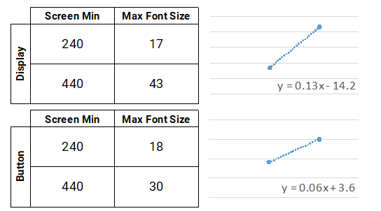 |
We can now calculate y in a new media query using calc(), a CSS native function that allows you to add, subtract, divide and multiply values.
1
2
3
4
5
6
7
8
9

@media only screen and (min-width: 240px) and (max-width: 439px) {
  #display {
    font-size: calc(13vw - 14.2px);
  }

  .button {
    font-size: calc(6vw + 3.6px);
  }
}
At this stage, in Firefox on my desktop, this all looks great.
On my phone however, we have a problem:
 |
So to fix this I found out the window size on the iPhone by calling:
1

calculatorDisplay.innerHTML = window.innerWidth;
This showed that the inner width of the browser window on my iPhone was 375px. So I added this point to my graph, along with the maximum font-size in whole pixels that would fit on a single line at that width:
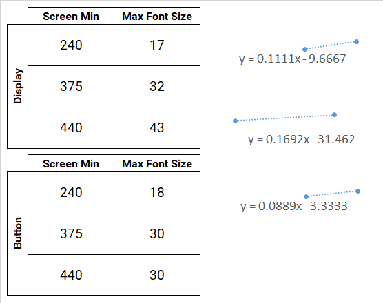 |
Exponential calculations are not possible using calc(), so non-linear relationships can’t be plotted, but what we can do is create a new breakpoint to mimic the change in rate in an exponential equation. I added a new breakpoint at 375 px so that on the iPhone it would look just right.
1
2
3
4
5
6
7
8
9
10
11
12
13
14
15
16
17
18
19

@media only screen and (min-width: 375px) and (max-width: 439px) {
  #display {
    font-size: calc(16.9vw - 31.5px);
  }

  .button {
    font-size: 30px;
  }
}

@media only screen and (min-width: 240px) and (max-width: 374px) {
  #display {
    font-size: calc(11.1vw - 9.7px);
  }

  .button {
    font-size: calc(8.9vw - 3.3px);
  }
}
The buttons looked just fine at 30px from 375 px width, so I set a fixed size. Adding this extra breakpoint has made the whole reponse far smoother. Whereas at smaller widths with the single scaling breakpoint, the lower font-size didn’t seem to match when breaking, now it is much closer in size.
Additionally, on IE, I spotted a different issue: all the buttons were aligned to the left of the row divs. Apparently justify: space-evenly isn’t supported by IE so I changed that to space-around to fix that issue.
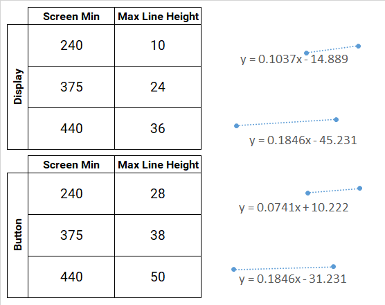
There is one issue left to fix regarding responsiveness: the size of the display. It looks just right at full size, but as the calculator resizes, the text is forced upwards to as the height of the display remains unchanged despite the reduced font-size.
Fixing the calculator’s display
First I removed the height declarations from .button, .row and #display-container, as well as .line-height from #display and .button. We will add them into the different breakpoints as appropriate.
 |
1
2
3
4
5
6
7
8
9
10
11
12
13
14
15
16
17
18
19
20
21
22
23
24
25
26
27
28
29
30
31
32
33
34
35
36
37
38
39
40
41
42
43
44
45
46
47

@media only screen and (min-width: 440px) {
  #display {
    font-size: 43px;
    line-height: 36px;
  }

  .button {
    font-size: 30px;
    line-height: 50px;
  }
}

@media only screen and (min-width: 375px) and (max-width: 439px) {
  #display {
    font-size: calc(16.9vw - 31.5px);
    line-height: calc(18.5vw - 45.2px);
  }

  .button {
    font-size: 30px;
    line-height: calc(18.5vw - 31.2px);
  }
}

@media only screen and (min-width: 240px) and (max-width: 374px) {
  #display {
    font-size: calc(11.1vw - 9.7px);
    line-height: calc(10.3vw - 14.9px);
  }

  .button {
    font-size: calc(8.9vw - 3.3px);
    line-height: calc(7.4vw + 10.2px);
  }
}

@media only screen and (max-width: 240px) {
  #display {
    font-size: 17px;
    line-height: 10px;
  }

  .button {
    font-size: 18px;
    line-height: 28px;
  }
}
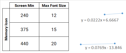
Finally, let’s just do the same for the memory icon.
 |
1
2
3
4
5
6
7
8
9
10
11
12
13
14
15
16
17
18
19
20
21
22
23

@media only screen and (min-width: 440px) {
  #memoryIcon {
    font-size: 20px;
  }
}

@media only screen and (min-width: 375px) and (max-width: 439px) {
  #memoryIcon {
    font-size: calc(7.7vw - 13.8px);
  }
}

@media only screen and (min-width: 240px) and (max-width: 374px) {
  #memoryIcon {
    font-size: calc(2.2vw + 6.7px);
  }
}

@media only screen and (max-width: 240px) {
  #memoryIcon {
    font-size: 12px;
  }
}
Okay, now we have all our CSS fixed, now we can focus on fixing our javascript.
Limiting number length
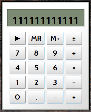
We have twelve digits to play with, but we can do a lot more using exponentials. In the current setup, an exponential will be displayed once the digit length exceeds 21 digits (e.g. 9.99999999999e+21). However, this gives us 17 digits, far too many for our display. So, we need to check when the result will exceed 12 digits and convert it into an exponential with appropriate precision.
1
2
3
4
5
6
7
8
9
10
11
12
13
14
15
16
17
18
19
20
21
22
23
24
25
26
27
28
29
30
31

function prepareOperation(elementId) {
  if (firstValue) {
    result = performCalculation(elementId);
    var formattedResult = formatResult(result);
    if (formattedResult) {
      calculatorDisplay.innerHTML = formattedResult;
      if (elementId === 'calculate') {
        resetVariableList();
      } else {
        firstValue = formattedResult;
        operator = elementId;
        clearDisplayFlag = true;
      }
    }
  } else {
    operator = elementId;
    firstValue = getDisplayValue();
    clearDisplayFlag = true;
  }
}

function formatResult(result) {
  if (result.length <= 12) {
    return result
  } else {
    var exponential = result.toExponential();
    var separated_parts = exponential.toString().split('e');
    var exponent_length = separated_parts[1].length;
    return result.toExponential(9 - exponent_length);
  }
}
So before we assign the result to the display, we format it with formatResult(). This function checks if the result is longer that 12 digits, and if it is then it converts it to an exponential. toExponential() has an optional argument which is the number of decimal places. To set this, we need to know how much space is left to play with.
We convert the exponential to a string and split it at the exponent marker “e”. This gives the length of the number and the length of the exponent. We know that in addition to the length of the exponent, we will also have to add back the “e” and that there will also be an integer and a decimal point. We then return the original result, this time converting to an exponential with the desired precision.